Not all design trends result in opulent living spaces; some can actually make your home appear less expensive. That's why we consulted designers to identify which trends to steer clear of in 2025, along with their recommendations for better alternatives.
Among the numerous design trends that ebb and flow, a few have remained so dominant that they now appear rather inexpensive. They have become excessively familiar and overly utilized, causing their elegance and charm to be drained away through repetition.
So these five once-loved but now has-been, interior design trends are the ones that designers are tweaking, dropping, and downright contradicting so as to make homes that are so much more lavish and sumptuous – expensive-looking, if you will.
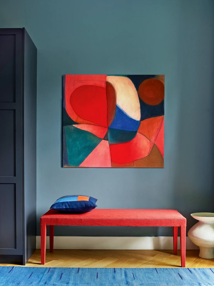
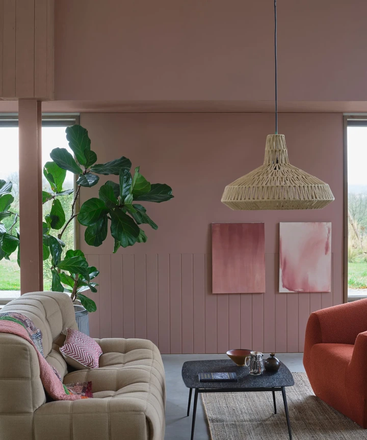
1. Art display walls
View pictures in App save up to 80% data.
It's actually very hard to make a gallery wall look elegant. Only the true professionals can curate spaces full of art that look upscale. A mix of cheap prints hung in cheap frames inevitably ends up looking, well, you guessed it.
The New York-based designer Noa Santos suggests focussing on vignettes instead of sweeping gallery walls. Add just one piece of art to a corner, and make that area special, rather than covered. And he has the perfect advice for how to do that.
"Noa suggests treating your phone as a creative instrument – envision yourself as a photographer and view your surroundings through the camera lens. 'What seems off? What appears incomplete? Use those observations as a starting point. Analyzing your photos can be quite revealing. Remember, design can be appreciated in subtle details, and you can begin by transforming just a small area of your home.'"
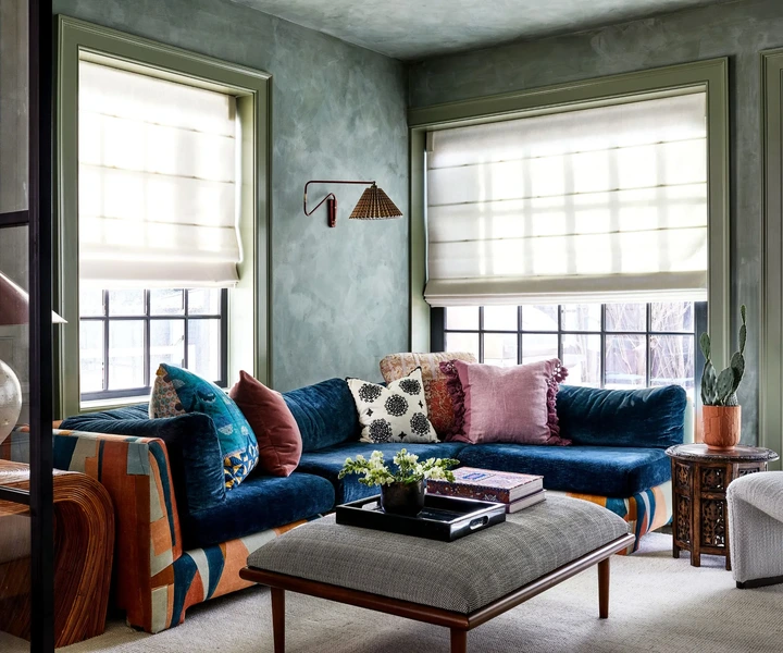
2. Coordinated color palettes
View pictures in App save up to 80% data.
There has been a rising color trend for going big on one shade, using it to drench a space, and then taking it to the furniture, too. The trouble is that it risks making everything look the same, you can't appreciate each individual piece, and it all gets lost in the whirl of a singly-toned space. It ends up looking like the person who designed the space didn't have any imagination, just picked a hue and ran with it. It can end up looking a bit cheap if not really well executed.
Designers say it's smarter to bring in a clash – something more daring and more refined. 'If the desired outcome is something a little more dramatic, you’ll want a contrast, rather than a color compliment,' says the interior designer Lara Bates, founder of the studio Lara Et Al. 'In that case, choose a dominant color in the room and go for the opposite shade on the color wheel for the wood trim.'
3. Light-colored or neutral walls
View pictures in App save up to 80% data.
It's time to say goodbye to white and gray walls permanently. While these colors may be simple and unobtrusive, they lack sophistication and can make your spaces feel bland and overlooked. Interior designers suggest that opting for deeper, more vibrant hues can elevate the look of your home, giving it a more luxurious ambiance.
'We’ve been moving even moodier, and my interiors will shift darker this year,' says the Washington D.C-based interior designer Zoe Feldman. 'Moody palettes, moody wallpapers, nothing super-fresh. I love deep greens, curry tones, lots of terracottas. I’m deep into port and would say brown over gray and white any time. These tones are the perfect backdrop on which to layer an element of surprise, a lapis blue vase, perhaps, that just seems to shine out against them, looking just so rich and inviting.'
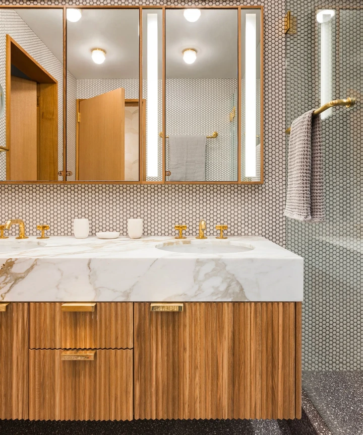
4. Streamlined countertops
View pictures in App save up to 80% data.
This is quite a challenging situation, but as the popularity of synthetic surfaces continues to grow—often selected for their cost-effectiveness rather than their sturdiness—countertops are becoming increasingly thinner. While using less material can lead to lower prices, it often results in a less premium appearance, which can give off a cheaper vibe.
One hack is to 'waterfall' the countertop material over the side of your bathroom vanity or kitchen cabinets for a couple of inches, to give the appearance of it being thicker and therefore more expensive looking. As Lara Bates rightly points out, ‘The deeper the stone you use, the more luxe a room feels.' And you can't really argue with that.
5. Maintaining an excessive level of symmetry
View pictures in App save up to 80% data.
Tying into the trend for too much matched color, is the growing trend for symmetry in interior design. It's a classic design trick, used to create order and rigidity in room layouts, but it often ends up looking dull.
While symmetry has its advantages, it can sometimes make a space feel less sophisticated, as it often misses the opportunity for depth and personality. A room exudes a more luxurious vibe when it features inviting curves, a variety of seating options, and an eclectic selection of furnishings.
'It’s got to be about using organic shapes, introducing an asymmetry that is unexpected and pleasing to the eye,' says the LA-based designer Brigette Romanek. 'I really like the curved sofas by Pierre Augustin Rose which just take the formality out of a room. Why should a coffee table be rectangular? Curved edges have more heart and soul,' she says.
Not all trends are ones to be followed, some can end up making you home look cheap whether that's because they are dated or just don't work in your home. Really the key to ensuring your home looks expensive is to decorate with meaning and only embrace trends that reflect your personal style.